Resort 13 | Jonathan Saunders
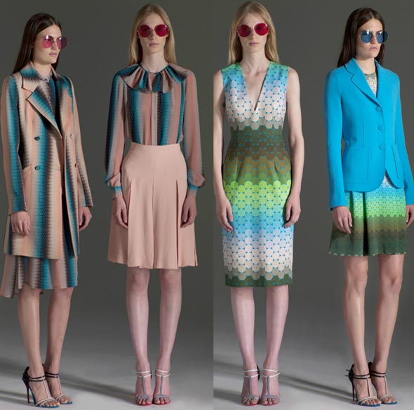
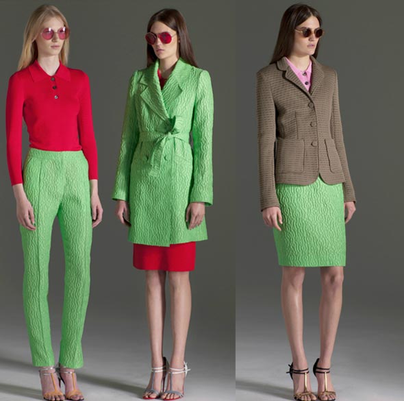
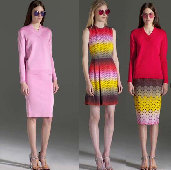
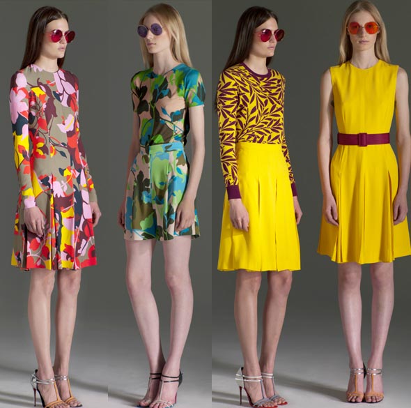
TrendsThe new Jonathan Saunders collection is a study in color; bright turquoise yellow, red, pink, lime green interspersed with muted tones like beige, maroon, muted greens and browns. There is quite a rainbow going on, but the colors are specific and look very deliberate and well researched. Prints rely on color as well. The 70’s look is definitely on its way back. Hope you haven’t thrown away any of your thrift store finds from the 90’s! Oh, and don’t you just love the mannequin poses in these photos?
-Claudia Brown


