Artist | Andy Gilmore
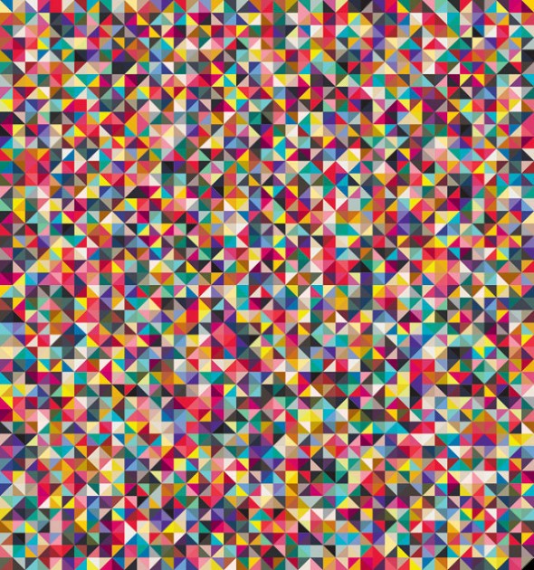
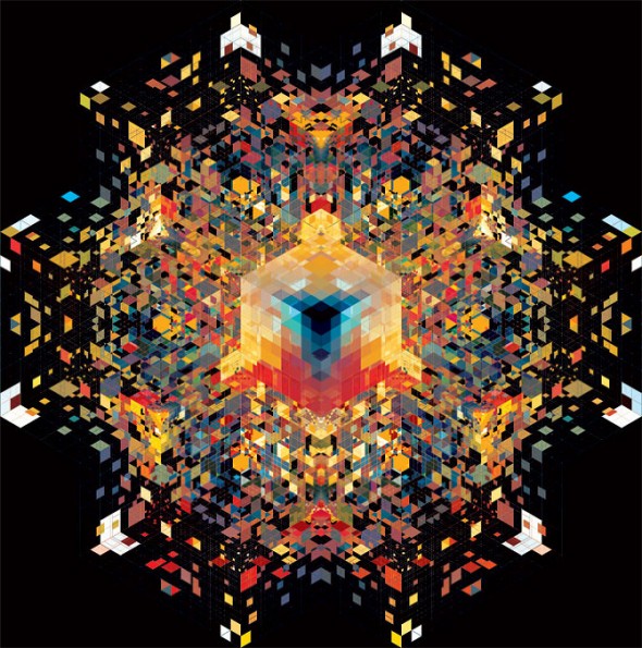
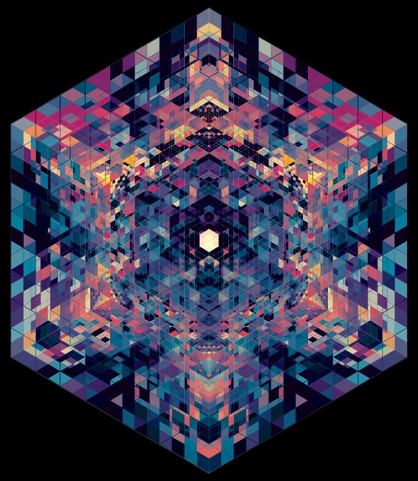
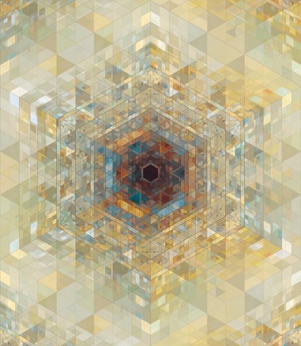
InspirationThe top image here has been on our walls for ages. It came from Wallpaper magazine, and each triangle represents a color that was used in the Spring 11 collections. The effect of the poster is optical, graphic, and eye-dazzling. Why it took me so long to look up this artist, I’ll never know, but his digital work is amazing. He has illustrated loads of features in magazines and newspapers (usually tech-y stories, with the exception of the Wallpaper poster.) Click on a pic to go to his website.
-Claudia


Love love love these prints!
Comments are closed.