Profile | Marc Curtis
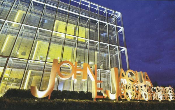
InspirationRecently, I visited the University of Oregon campus as a favor to a young friend of mine that wanted to get some insight about their interior design program. While there, we checked out the John E. Jaqua Center for Student Athletes, which my husband Marc Curtis had a big part in designing while working for ZGF Architects. Marc has worked as an interior designer for 13 years, mostly practicing a very minimalist aesthetic.
He has since left corporate servitude to open his own business with two partners: a bar called the Landmark Saloon inspired by saloons of the early 1900’s. And with this change has come a drastic change in aesthetic.
I interviewed Marc about the Jaqua Center, his minimalist past, and his current progression into warm organic design which seems to align with the turn that interior design and architecture have taken in the last few years. For Marc, this is actually a return to his childhood roots, set in the Southern California of the 1970s–rustic, filled with orange farms, animals, loads of outdoor activities and parents fond of old country music.
Can you describe your childhood surroundings? What were your biggest Influences?
We had lots of animals: horses, goats, sheep, chickens, quail, rabbits, chinchillas, cats, dogs, and my family was heavily involved in 4H. California was country back then. We played and rode horses in the undeveloped hillsides. So Country Americana is ingrained in who I am. My business partners, who were friends first, Erica Nukaya and Tim Hawk, have similar roots. We all go camping and enjoy the outdoors a great deal and we wanted to bring those roots to our place. It’s an extension of who we are.
What brought you to design such drastically Modern spaces?
In general, I have a very dualistic nature, so I am totally comfortable with both rustic organic design, and minimalism. I studied Architecture in the Netherlands and I was heavily influenced by the Dutch Modernists. I love how cerebral and extremely thought out Modern Design has to be. A lot more thought goes into those spaces than you would think. You’re working with elements like light, shape, space, and very elemental materials. Everything is so pared down, you cannot fake anything. The mental challenge of that appeals to me.
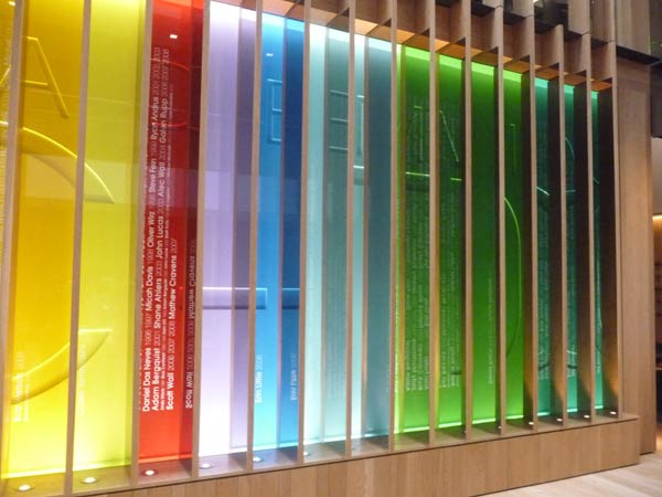
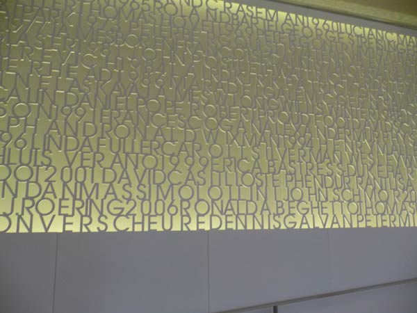
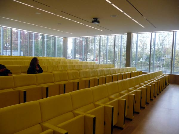
Your last minimalist project was the John E. Jaqua Learning Center. From a surface design perspective, what were some of the challenges of creating that interior?
We were constantly coming up with new ways to integrate our designs into the architectural fabric of the space so they had an authentic relation to each other. We didnt want to just apply another layer over the top. This required a great deal of research and testing. Lasers and CNC machines helped a bunch!
What is the bathroom tile all about?
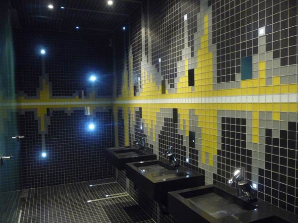
The bathroom is a recognition of Don Essig, a famous announcer at U of O, and his famous line “It Never Rains at Autzen Stadium.” We recorded his voice, created a graphic representation of that recording, and that became the tile pattern in the restrooms.
What are some other projects of yours that have influenced this design?
Other Nike funded projects. They have deep pockets and will reach into them to achieve a unique result. The Sports Medicine Center on the campus was a direct predecessor to this project. Its a clearly visible progression. Besides that, every project informs the ones that come later.
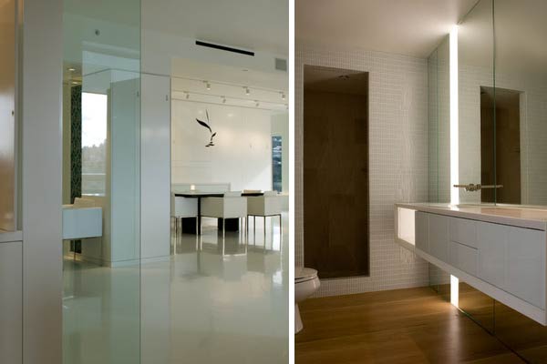
The project I worked on before that was for a penthouse in Portland, which was one of the most minimalist projects I’ve ever worked on. There was a white epoxy floor that we had to re-pour seven times. That probably sums up it up right there.
Can you tell me about your latest design project, The Landmark Saloon? How was it different to design a space for yourself, where you are both the client and the designer?
For me, being able to design a space for myself is extremely refreshing. I love it when the process can happen organically. Decision making is one of the most tedious parts of the processes when you are working for someone else. For the Landmark Saloon, we were able to be fast, effective and cheap while still surpassing our initial notions of how it would turn out. The design aesthetic was much different than the usual modernism of my past projects but I had really grown tired of that so I loved being able to explore a less anal retentive aesthetic, a western saloon.
What was your thinking behind the wallpapers and other surfaces at the Landmark?
We did a great deal of searching around for inspiration before we even had acquired this space. We started with material textures and patterns at first. Of course, we looked at photos of old saloons and the types of Victorian-inspired wallpapers that were used. We wanted it to look like it had patina and had been there forever. The Pendleton blankets were used to create warmth and interest in one of the rooms. We were also drawing on local heritage.
The colors, textures and patterns are applied the way they are to reinforce the progression from one part of the space to the the next and create a feeling of coherence. Each room is different but very related to the others through color, light and texture.
I know you’ve dealt with lots of textiles, wallpapers and other surface materials as an interior designer. What are some of your favorite designers? Some of the most innovative or interesting surface treatments you’ve come across?
In textiles I love texture before print. I like when a fabric has a texture that is an honest result of what it is made from and how its made. The natural roughness of some wools, the luxury of a fine mohair or the patina of a well used leather is what speaks to me the most. They also have staying power. Lines like Kvadrat and Knoll fabrics are like that.
Do you have a dream project that you’ve always wanted to work on?
a public park where people can have a good time without having to spend money. I would also love to build a cabin in the woods for me but i think thats more about the woods than the cabin.
-Claudia Brown

